Visual identity - Colors
Colors
There's a science to color. It's part visual chemisty and part psychology. Balancing both makes for a palette that's a powerful tool for establishing uniqueness. Our colors help to structure information and conveys the spirit of our brand.
We lean on a mix of neutrals - black, white and grey as our primary colors. Those are amplified with a distinctive gradient that surfaces in specific moments to assist and support content.
Color Palette
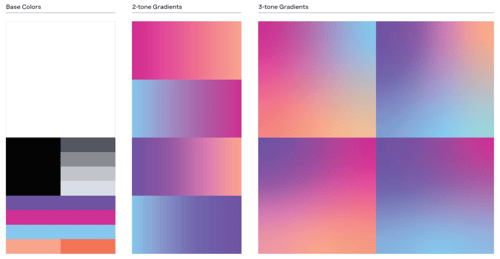
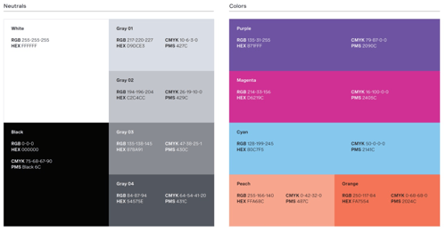
Our color palette consists of a set of base neutrals and colors, the latter of which are used to build two distictive sets of gradients.
In most instances, our brand should feel light, therefore white should be the primary base, and black used more sparingly.

Color Values
This offers the specific information on the color breakdowns of each color within the brand system.
RGB and HEX values are provided for digital or on-screen applications, and have been optimized to work across a variety of digital displays.
PMS and CMYK values are provided for print applications, and should be used depending on the printing method.

2-tone gradients
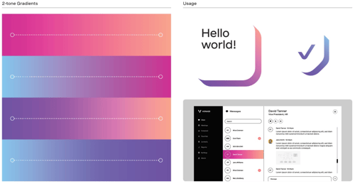
Our 2-tone gradients and used to color limited areas (surface area higher than 1:2 ratio), such as thinner extrusions, found in our graphic systems or pictograms.
When used within extrusions, 2-tone gradients should be used as washes in 0, 45 or 90 degree angles, and never in parallel with the extrusions (see Incorrect Usage for reference).

3-tone gradient
Our unique 3-tone gradient represents the smart tech that is always working underneath the surface. They should be used in the surface areas up to 1:2 ratio.
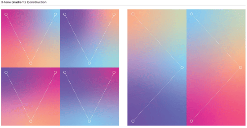
Using our base colors (with Peach, not Orange) as color nodes that are blended together, they are always built in a V formation within a container.
The optimal orientation is to have 2 color nodes placed on each end of the widest edge, and another color node, centered between the 2 nodes, placed on the opposite edge. This ensures the gradients are smooth and well-blended.
