Visual identity - Illustrations
Intro
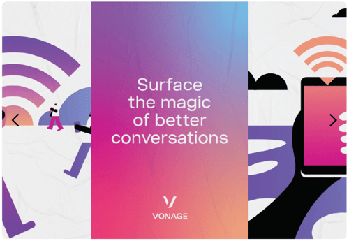
Illustrations allow us to tell stories and inject a sense of irreverence where photography and pictograms can't. Our illustration style is abstract enough to flex for futuristic visions of how people may communicate. But grounded enough to depict scenarios that we all understand and can relate to.
Our style leans on cues from the rest of our system including extrusion, gradient, and perspective shifts. All of them blended together in the foreground and background with characters that are lovable and relatable.
Overview
There are two styles for illustrations, differing by perspective they are drawn in. Our primary illustration style is drawn with a single vanishing point, while our secondary illustration style utilizes an isometric point of view.
The primary illustration style should be more commonly used to convey Vonage's expertise across customer interactions, technology, and unified communications.
Secondary isometric illustrations should be used to communicate stories about Vonage's offerings and scalability, when a macro view is more advantageous.
Both styles of illustration fit into three general buckets:figures, technology, and scenes.

Color usage
Illustrations are filled with color utilizing the same rationale as our visual systems. The directionality of color is used to unite visual elements and emphasize moments within the illustration.

In use
Illustrations make a strong visual impact and are used when emphasizing or supplementing content or messaging. They are a powerful tool to support content while also infusing elements of the Vonage brand into print and digital applications.
