Visual identity - Infographics
Intro
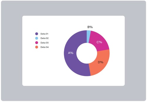
We often tell stories or depict functional information that involves data. But we all know that no one wants to look at a speadsheet of numbers. So we developed an infographic style that includes stylized charts, graphs, and diagrams so our data stories can come to life in engaging ways.
These elements utilize out colors, extrustions, and typogrpahy to ensure that our data visualization is distinctly Vonage.
Charts and graphs
In general, charts and graphs should clarify content, not complicate it. From selecting the clearest chart style to utilizing color-coding, every design choice should make the data easier and simpler to understand.
Here are examples as a starting point for the overall look and feel of infographics.

Outlines and extrusions
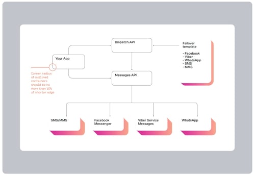
Outlines and extrusions used in layout designs can also be applied to infographics like flowcharts, or more expressive data visualizations like extruded bar graphs.
Extrusions can function as a highlight device, or as a visual implication of the data represented by changing the depth of extrusions.
Outlines should be used with a thin black stoke and rounded corners with radius no more than 10% of the shorter edge of the shape.
Refer to the Extrusions section for extrusion construction guidance.
