Visual identity - Typography
Intro
Unique typography ensures that our words stand out in a sea of sameness. it's one of the hardest working tools in our toolkit because in ensures that even when there's no color, photography, or illustration, our content looks and feels like us.
Our type is bold and confirdent in headlines, and easy to read in bold copy. It's the visual manifistaion of the Vonage voice - inclusive and empathetic.
Overview
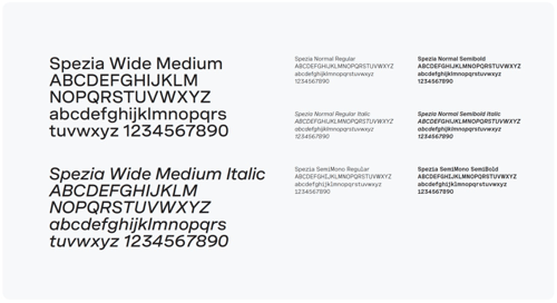
The typeface Spezia was designed by the Swiss type founded Luzi Type, and our visual identity utilizes several styles and weights within the Spezia family.
Please contact the Brand Team for typeface licensing needs.

Type hierarchy
We use typography to diffrentiate informaiton, create hierarchy, and build visual cohesion. This outlines the basic relationships between typefaces and the levels of information that will be needed in the brand.
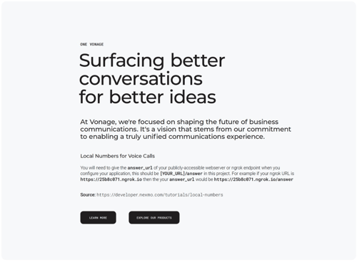
Headlines and subheads are always set in Spezia Wide Medium. Body copy is always set in Spezia Normal Regular, with SemiBold for active call-outs and Italic for passive call-outs. Eyebrows and CTAs are all set in caps in Spezia SemiMono SemiBold; and captions annotations, short descriptive copy and specifications are set in Spezia SemiMono Regular.
Always adhere to the correct type hierarchy, and follow the font size and leading relationship.

Google Typefaces
For Google platfroms where the brand where the brand typeface is unavailable, set headlines and subheads in Montserrat Medium. Body copy is set in Roboto Light, with Medium for active call-outs and Italic for passive call-outs. Eyebrows and CTAs are set in all caps in Roboto Mono Medium; and captions, annotations, short descriptive copy and specifications are set in Roboto Mono Light.

System Typefaces
For system platforms where the brand typeface is unavailable, set headlines and subheads in Verdana Regular. Bold copy is set in Arial or Helvetica Regular, with Bold for active call-outs and italic for passive call-outs. Eyebrows and CTAs are set in all caps in Arial or Helvetica Bold; and captions, annotations, short descriptive copy and specifications are set in Courier Regular.
